Lesson 3:
CREATE DESIGN FOR A SIMPLE PROJECT
LEARNING OUTCOMES:
At the end of this Lesson you are expected to do the following:
At the end of this Lesson you are expected to do the following:
- LO 1. Sketch simple project design; and
- LO 2. Produce simple project;
Definition of Terms
Definition of Terms
- Asymmetrical - having no balance or symmetry.
- Balance - a state of equilibrium or parity characterized by cancellation of all forces by
- Cacha - a kind of cotton cloth good for beginner sewer for project making.
- Colorfast – do not fade easily
- Design – a blueprint
- Emphasis - a special attention or effort directed toward something.
- equal opposing forces.
- Harmony - means a relationship of different portion of a design
- Hue – the family group name of a color
- Intensity – means the brightness or dullness of a color
- Primary Colors – the sources of all colors
- Proportion - part considered in relation to the whole.
- Proportion – is the pleasing relationship of all parts of the object with one another.
- Rhythm – these are smooth movement repeated again and again
- Secondary Colors – are produced when mixing two equal amount of primary colors
- sides of a dividing line or plane or about a center or an axis.
- Symmetry - exact correspondence of form and constituent configuration on opposite
Learning Outcome 1: Sketch simple project design
PERFORMANCE STANDARDS
Materials
-Pictures
- Catalogue
- Different kind of designs
PERFORMANCE STANDARDS
- Design for a simple project is sketched applying the principles of
Materials
-Pictures
- Catalogue
- Different kind of designs
What Do You Need To Know?
Read the Information Sheet 1.1 very well then find out how much you can
remember and how much you learned by doing Self-check 1.1.
Information Sheet 1.1
PRINCIPLES OF DESIGN
The principles of designs are concepts used to organize or arrange the structural
elements of design. These the ways in which these principles are applied the affects the
expressive content, or the message of the work.
|
Principles
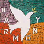
Balance - According to this principle, from the centered of the dress, design should be identified on both sides may be achieved ways: a. Symmetrically or the formal balance - can be described as having equal "weight" on equal sides of a centrally placed like a see saw. This is an easy way of balancing but such balance lends monotony to the design. b. Asymmetrically or the informal balance – When The structure decoration and accessories are different both sides from the center of the design. In this design attraction both sides is created by using different accessories. c. Proportion - is the pleasing relationship of all parts of the object with one another. Proportion refers to the relative size and scale of the various elements in a design. The issue is the relationship between objects, or parts, of a whole. Emphasis – every pleasing design has one part that is more interesting than any other. This is the emphasis or the center of interest. Rhythm – these are smooth movement repeated again and again. Rhythm is an important principle of art. It is created by repeated use of the design. If there is rhythm in a design, the eye would move easily from one part to the other. Rhythm can be created in three ways in a design: a. Repetition of lines, colors, or accessories. Parallel lines are formed by the use of seams, buttons, embroidery, lace, etc. which helps uninterrupted eye movement. b. Radiation. Rhythm can also be created by the radiated lines. These lines are created by gathers Eyes can move easily from one part to the other on the small lines created by gathers. Such lines can be seen in gathers on neckline, arm and skirt. c. Gradation. Rhythm can be created by gradual change of lines, shape or shade of the color. Harmony - means a relationship of different portion of a design. Harmony should be achieved through judicious use of color, shape, and texture to give a feeling of oneness. |
Information Sheet 1.2
COLOR THEORY
The first thing you usually notice about clothes or anything is their color. Before you
start studying which colors look best together, you should learn the meaning of color terms
and the rules that apply to colors.
The Color Wheel
COLOR THEORY
The first thing you usually notice about clothes or anything is their color. Before you
start studying which colors look best together, you should learn the meaning of color terms
and the rules that apply to colors.
The Color Wheel
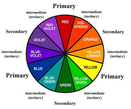
Primary Colors – the sources of all colors, even though there are thousands and thousands of colors in the world, they are all made up of these colors – red, blue and yellow.
Secondary Colors – are produced when mixing two equal amount of primary colors. If you mix equal amount or yellow and blue you will have green, equal parts of red and blue will have violet, and red and yellow you will have orange.
Look at the color wheel you will find these colors – orange, green and violet.
Intermediate Colors – are produced by mixing two equal amount of primary and secondary colors. Example, if you mix equal parts of yellow (primary color) and green (secondary color) you will have yellow-green. Noticed that yellow-green is found between yellow and green on the color wheel.
The intermediate colors are;
Yellow + green = yellow-green Red + violet = red-violet
Blue + green = blue-green Red + orange = red-orange
Blue + violet = blue-violet Blue + orange = blue-orange
Pure Colors – are the primary, secondary and intermediate colors because they have no white, black and gray in them. Pure colors are also called ―normal, true and basic colors”.
Tints – when pure colors are mixed with white, they are made lighter. Example, when white is added to red you have pink. In other words pink is a tint of red. The more white you add, the lighter the pink will be. Tints are also called ―pastels”.
Shades – when pure colors are mixed with black, they are made darker. Example, when black is added to red you have maroon, a shade of red. The more black you add, the more darker you have.
Grayed colors – most colors we used in clothes are grayed colors rather than bright, pure colors you see on the color wheel. Grayed colors are also referred to as ―soft colors‖ or ―”dull color”. The more gray you add, the more duller the color will be.
Neutrals – are white, black and gray. They look well with another and with all other colors. The more grayed colors becomes, the more different colors it will harmonize with.
Warm and Cool Colors
Cool colors – are green, blue-green, blue, blue-violet, violet. Blue is the coolest color. They are adjacent to one another in the color wheel.
Warm colors – are red, red-orange, orange, yellow-orange, and orange. Red is the warmest color. They are also adjacent in the color wheel.
Qualities of Colors
Hue – is the family group name of a color. It is the name of a color. Ones they are combined differently and given new names.
Value – refers to the lightness or the tint or the darkness of the shade. The scale of the value colors are from the very lightest tint to the very darkest of the shade.
Intensity – means the brightness or dullness of a color. When you refer to a color as ―bright‖ or ―very bright‖ or ―dull” or ―very dull” you are describing its intensity. Example, green peppers are bright yellow-green, while olives are dull yellow green.
Color Schemes
The beauty of any color scheme depends upon how well the colors harmonize. To harmonize, colors must appear to belong together.
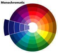
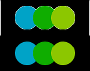
1. One-color harmony (monochromatic color) – the easiest color scheme to follow is one that uses the same color in different values and intensity. Example, dark blue suit with very dark blue accessories and a light blue blouse.
The beauty of any color scheme depends upon how well the colors harmonize. To harmonize, colors must appear to belong together.
1. One-color harmony (monochromatic color) – the easiest color scheme to follow is one that uses the same color in different values and intensity. Example, dark blue suit with very dark blue accessories and a light blue blouse.
|
|
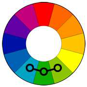
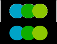
2. Adjacent color harmony – or analogous color harmony. Since they are near each other on the color wheel, neighbor color harmony. Example, yellow-orange, orange, and yellow green are next to each other on the color wheel; therefore, a pleasing adjacent color harmony may be made from them.
|
|
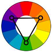
3. Complementary Color Harmony – these are colors that are opposite in the color wheel. Using these colors may be very pleasing.
a. Complementary colors – directly opposite in the color wheel. Example, red and green, blue and orange, yellow and violet
a. Complementary colors – directly opposite in the color wheel. Example, red and green, blue and orange, yellow and violet

|

|
b. Split complementary colors – a variation of the complementary color scheme. In addition to the base color, it uses the two colors adjacent to its complement.

c. Triad - A triadic color scheme uses colors that are evenly spaced around the color wheel. Triadic color harmonies tend to be quite vibrant, even if you use pale or unsaturated versions of your hues.
|
|
LEARNING OUTCOME 2
Produce simple project
PERFORMANCE STANDARDS
Materials
Sewing Tools
- Needle
- Plain cloth (any color)
- Thread (any color)
Produce simple project
PERFORMANCE STANDARDS
- Project produced in accordance to the specifications of designs
Materials
Sewing Tools
- Needle
- Plain cloth (any color)
- Thread (any color)
What Do You Need To Know?
Read the Information Sheet 2.1 very well then find out how much you can
remember and how much you learned by doing Self-check 2.1.
Information Sheet 2.1
BASIC HAND STITCHES
Sewing the basic hand stitches are very easy if you learn each step thoroughly before you start practicing the next step. Sewing by hand is a skill that most, if not all, people should probably attempt to master at some point.
|
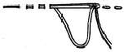
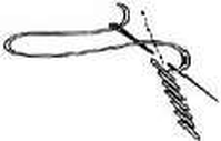
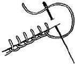
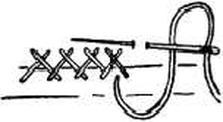
Back Stitch
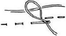
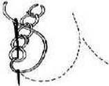
Make one running stitch, then take a back stitch to the beginning of the first stitch, thus overlapping each running stitch. Resembles machine stitching and is used to strengthen a seam made by hand. Basting Basting is quite important in successful sewing. This is used to hold fabric temporarily in place, until permanently stitched. There are four types of basting; hand basting, machine basting, pin basting and basting edges with an iron. Running Stitch To make this stitch, push point of needle in and out of fabric until you have several stitches on the needle. Hold fabric taut with left hand, pull the needle through. Practice until you make fine even stitches. Outline Stitch This stitch is similar to the back stitch but it is slanted. Make one slanted backstitch in front of another letting each one overlap the one before it just a little bit, until the design is filled. Blanket Stitch Put your needle in 1/4 inch from the edge of the fabric, put the thread under the point of the needle and pull through. Catch Stitch This is used for a flat finish next to fabric, such as seam binding on a hem. Hold open hem edge away from you, work from left to right, Take a stitch in the hem, then a tiny stitch to the right just beyond edge of hem with the point of needle to the left. This makes diagonal lined that cross each other. Chain Stitch Insert the needle in and out of the fabric (as in the running stitch). Bring the thread under the tip of the needle while still in the fabric, then pull the needle through. |
|
